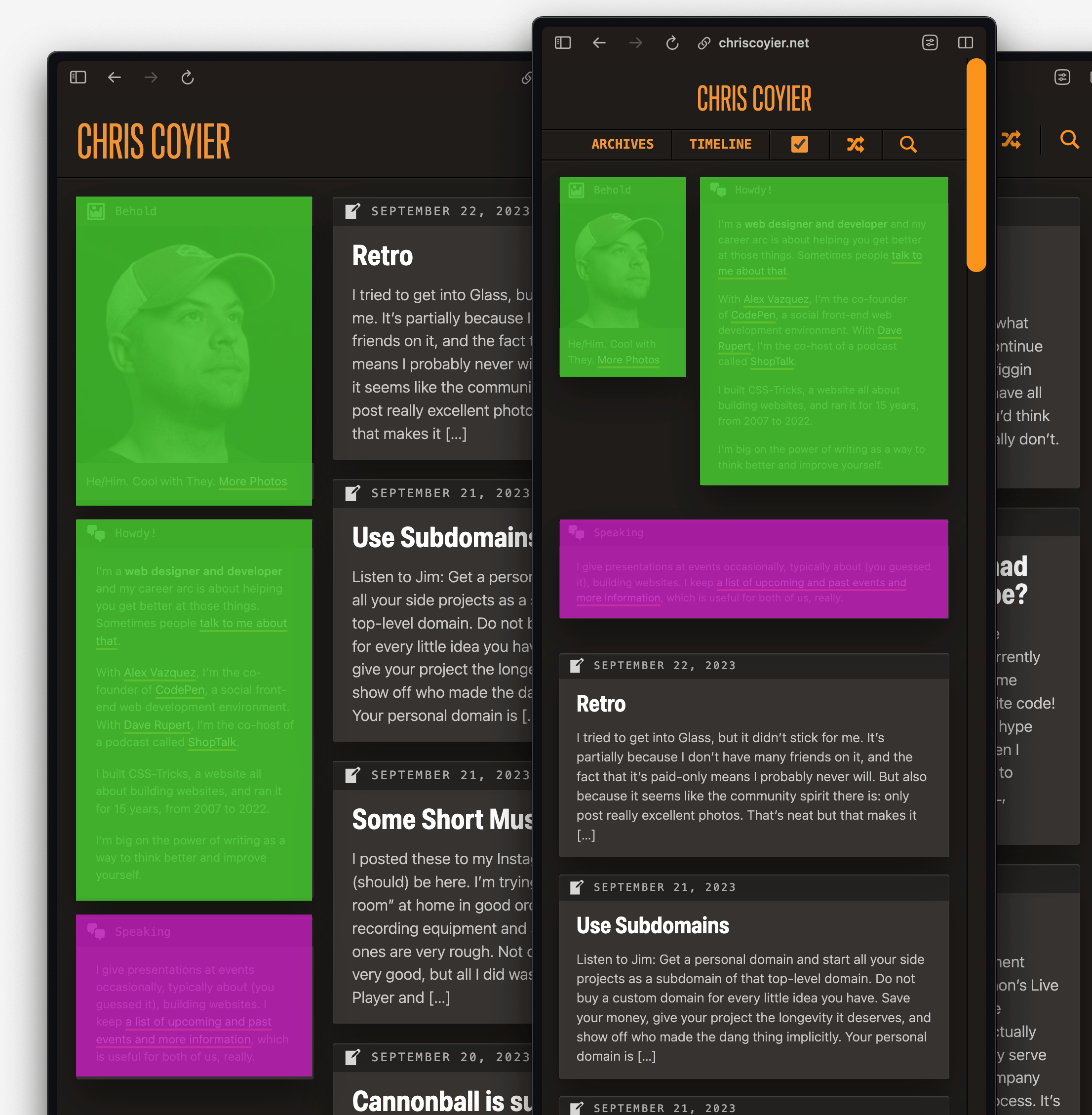
Check out this layout I wanted to pull off on the current design of this site:

See how just the first two boxes in the “sidebar” of the homepage are set side-by-side on narrow (mobile) layouts.
One way I could have done that is to target the sidebar, and turn it into a grid at that size so I could do the layout I wanted to with the first two boxes, then make sure all the rest of the boxes fill the width.
aside { ... @media (max-width: 750px) { display: grid; gap: 1rem; grid-template-columns: 1fr 2fr; .box:nth-child(n + 3) { grid-column: 1 / -1; } } }Code language: CSS (css)But. I didn’t do it like that.
Something makes my brain go: Why involve all the rest of the boxes in this little scheme of yours? They are innocent bystanders.
So to isolate the functionality, I wrap the first two boxes in another div I can target.
<aside> <div class="mobile-grid"> <div class="box">1</div> <div class="box">2</div> </div> <div class="box">3</div> <div class="box">4</div> <div class="box">5</div> </aside>Code language: HTML, XML (xml)Even with that, I could have the mobile-grid be a grid with a single column, then change to the multi-column setup at the narrow breakpoint (probably should be a container query honestly).
But. I didn’t do that either. I did this:
.mobile-grid { display: contents; @media (max-width: 750px) { display: grid; grid-template-columns: 1fr 1fr; gap: 1rem; } }Code language: CSS (css)That display: contents; bit says: pretend like this element doesn’t even exist and move all the children up one level in the DOM.
I’m still using a breakpoint, but I can focus the styling to be like this only matters when this element “kicks in”. I like that approach, as it isolates functionality to the relevant elements.
HUGE WARNING.
Using display: contents; has a bad accessibility history. I’ve mentioned this before, but accessibility expert Eric Bailey has straight up said: display: contents considered harmful and means it:
I now view the declaration as predictably unpredictable. The common response of “just test its support with assistive technology” does not apply here, either—there is a non-trivial chance that desirable behavior for the declaration in a current browser version isn’t guaranteed to persist for future versions of that browser.
To reiterate the severity at play here: display: contents’ behavior is akin to the links you use on your website or web app one day losing the ability to work because you applied CSS to them. This loss of ability comes without warning, and there’s no console error or visual indication that things are amiss.
Part of why I wanted to play with this is because I saw that Safari 17 has shipped (on desktop next week), and I count twelve fixes for display: contents in the note. Now Safari is just one browser, and the fixes in bleeding edge version don’t make this a solved problem. I made the decision to use it because:
<a> links inside, and if they were rendered as “just text” that would be broken, but I don’t think that’s the case right now after looking at the accessibility tree (Chrome, Firefox).As a general best practice for now, I’d agree with “don’t use it” for now. I showed an approach to making this work that’s perfectly fine first.
Also, here’s that approach converted to container queries instead:
aside { ... container: aside / inline-size; .mobile-grid { @container aside (max-width: 300px) { display: grid; gap: 1rem; grid-template-columns: 1fr 2fr; } } }Code language: CSS (css)Feel free to smurf around with this reduced test case.
Related
ncG1vNJzZmibmKe2tK%2FOsqCeql6jsrV7kWlpbGdgbnxzfo6aZKankp65pnnOp6OyZZentqV7